Selecting the right paint colours for your home can often feel like a daunting task, especially when there are so many trends and pictures of painted walls floating online. Which one is the right colour for your home? How does it meet your space’s demands and express your unique personality? The questions seem to be infinite.
However, the process of choosing the ideal hues for your home’s interior doesn’t have to be a source of stress. By following these expert tips, you can select a colour palette that not only enhances your space but also truly reflects your personal style.
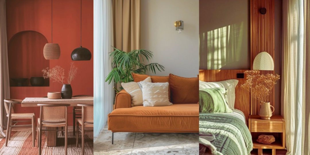
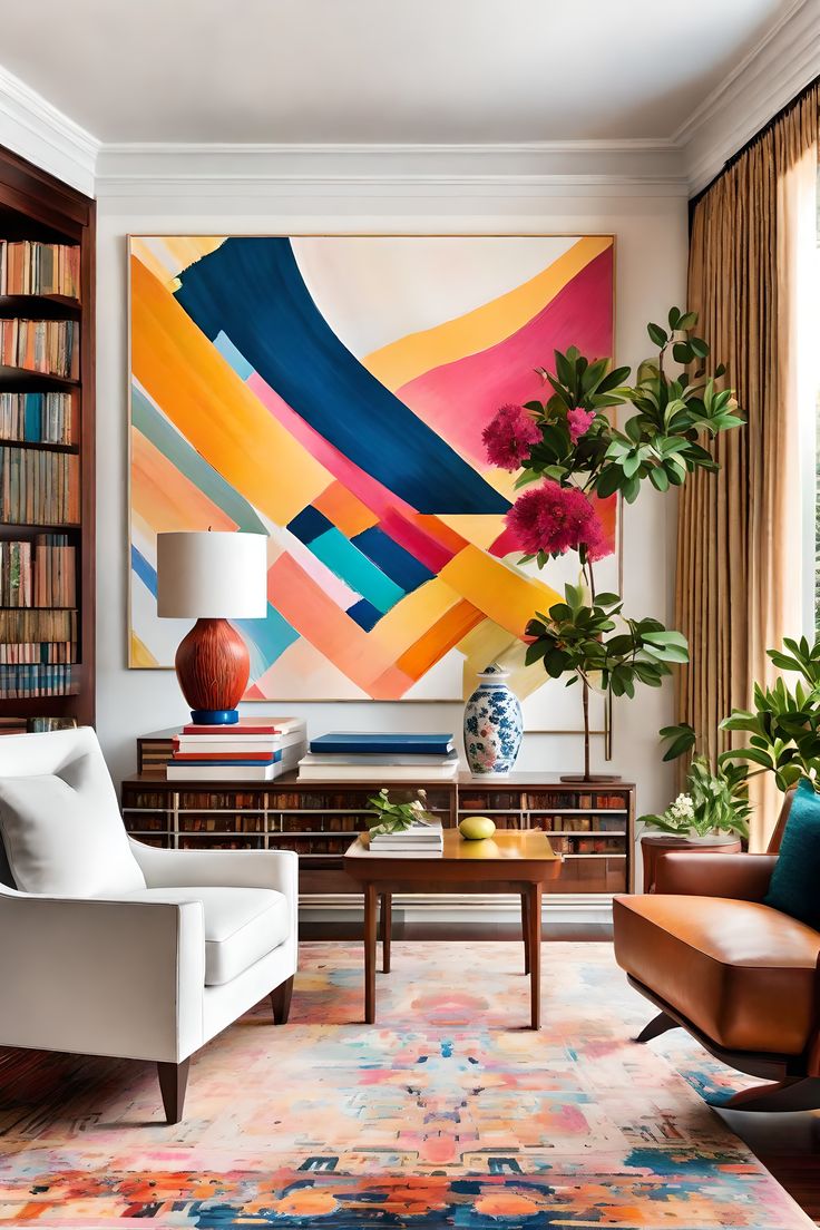
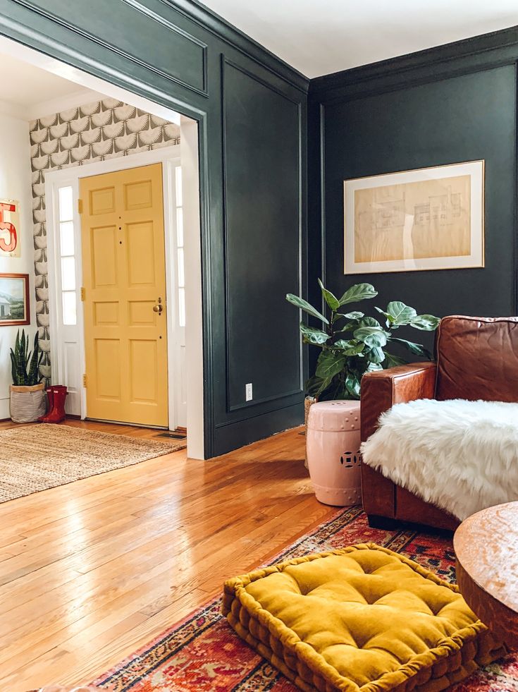
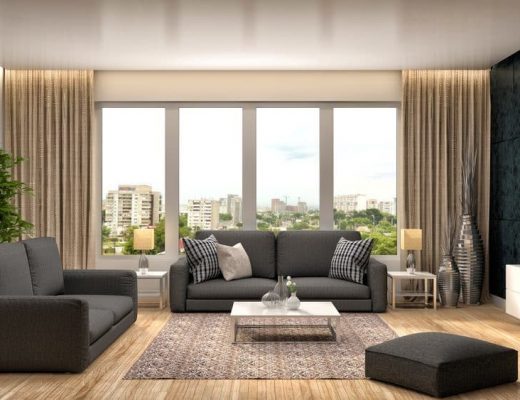
The 60-30-10 Rule
Divide the room’s colours into three proportions: 60% for the dominant colour, 30% for the secondary colour, and 10% for the accent colour. The dominant colour includes the painting of the wall, cabinets, large furniture, etc., which sets the overall tone, the secondary colour includes upholstery, floor covering, or curtains which complement the dominant colour, and the accent colour includes accent pieces, accessories, artworks, etc., which adds pops of interest and personality to your space.
If you’re choosing paint for your new room, you can choose any colour as your dominant colour and then buy curtains and other pieces like tables and chairs in a secondary colour and may add an accent wall in a third colour. However, if you’re painting a room with existing furnishing, observe the dominant colour in the room and choose a paint that goes with that colour. For example, if you have mahogany cabinets in your room, you can paint your walls in olive, beige, or white. Again, you can choose tangerine, mauve or blue walls if your furniture is white coloured.
What About The Lighting?
The first step in your colour selection journey is to carefully evaluate the natural and artificial lighting in each room you plan to paint. This is crucial because lighting significantly affects how colours appear.
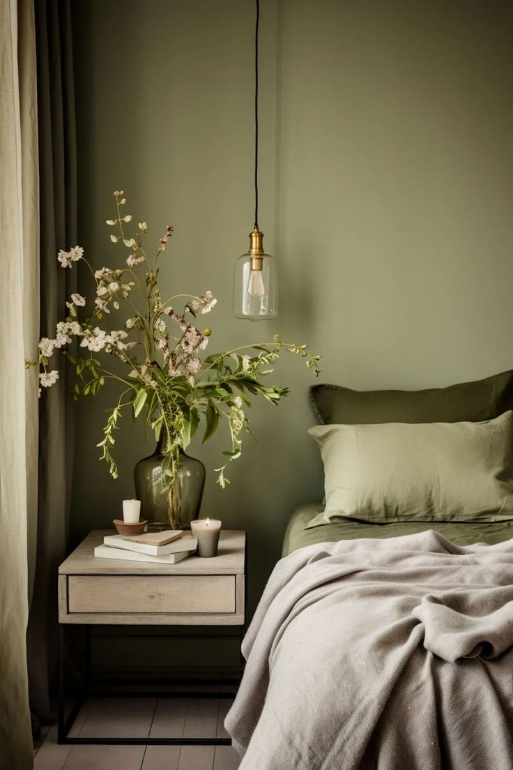
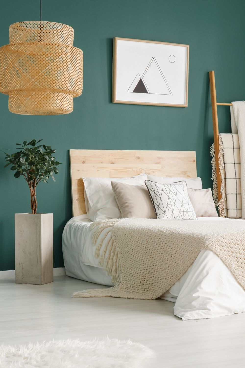
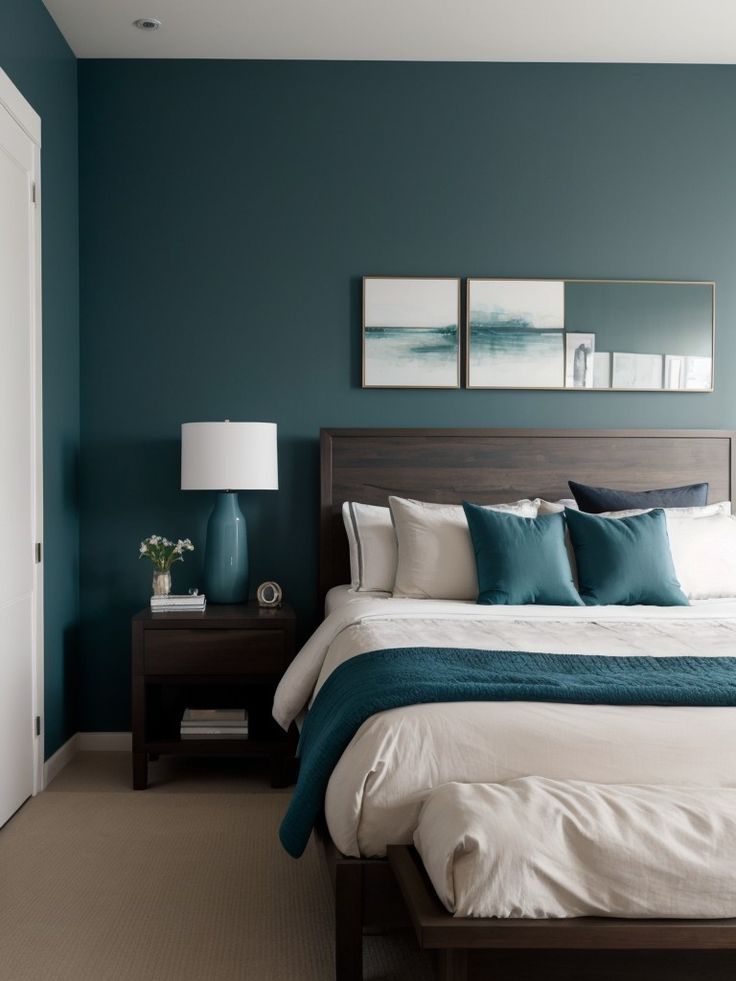
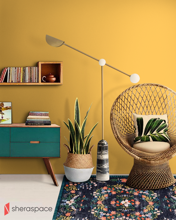
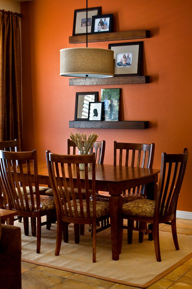
The concept of cool and warm tones is important to remember. Cool tones are colours with a blue undertone, such as navy, teal, purple, magenta, chalk white, grey, turquoise, etc. On the other hand, red tones are colours with a red undertone, such as brown, beige, green, red, orange, olive, coral, etc.
Since a north-facing room receives little direct sunlight, painting it in cool colours will make it appear dark and muted. That is why you should avoid cool colours for rooms that face north and opt for warm colours instead. Conversely, opt for cool colours for a south-facing room that gets plenty of sunlight, so it can balance the intensity of the sunlight and create a tranquil atmosphere.
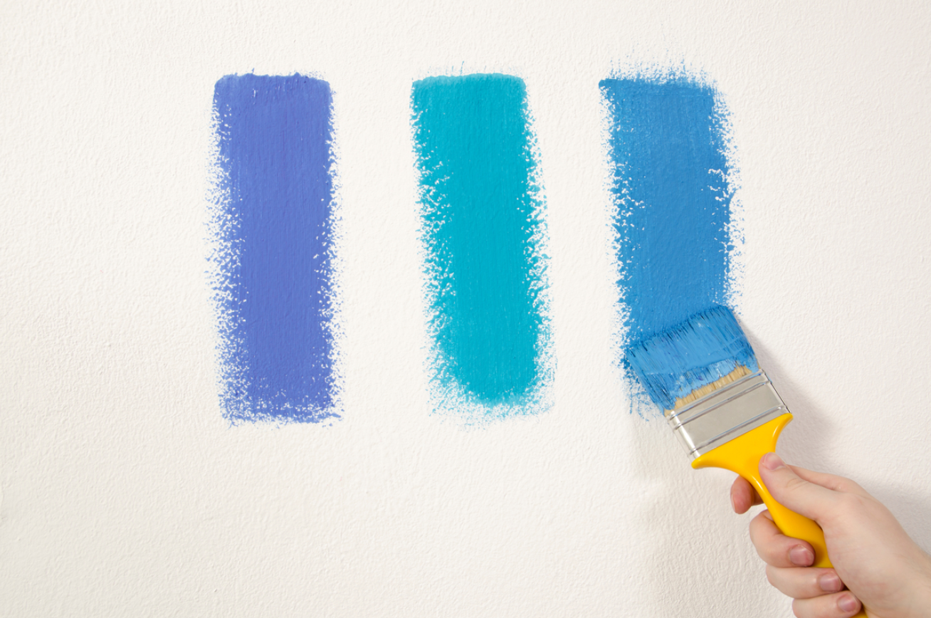
It’s essential to test paint chips at various times of the day to see how the colour changes with the light. Don’t just look at the swatch on paper; view it on the wall where it will be applied. The size of the room and competing elements, such as flooring and furniture, also impact how a colour is perceived.
White walls or Colorful walls?
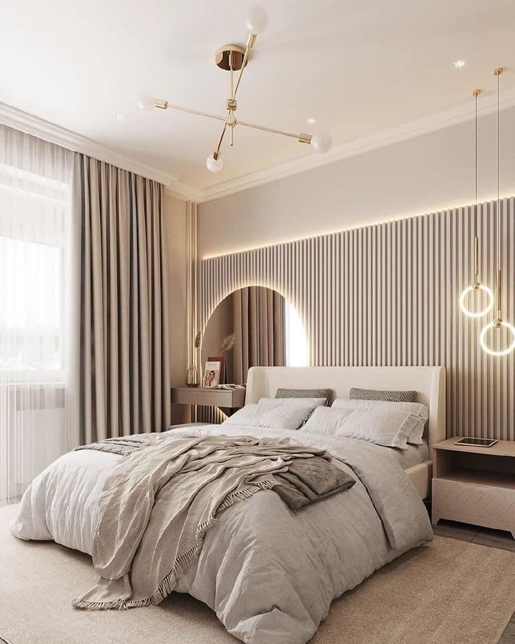
When it comes to selecting interior paint colours, understanding the nuances of whites and other shades is crucial. Pure whites offer a blank canvas, ideal for highlighting artwork or ceilings. Warm whites, infused with yellow or pink undertones, can cosy up dimly lit spaces or large rooms. Conversely, cool whites, tinged with blue or green, create an airy feel, expanding smaller areas.
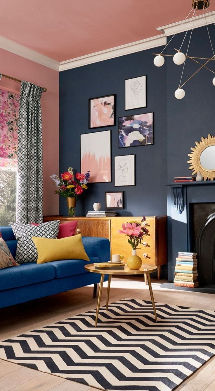
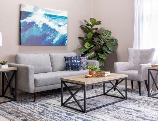
Don’t be afraid to experiment with different shades to find the perfect match for your space. Start with a colour you love, such as one from a rug or painting. If the colour feels too intense, consider asking the paint store to adjust its intensity or mix grey with it for moderation. However, overwhelming a space with multiple bold hues; instead, let standout pieces, like vibrant rugs, shine against softer wall tones.

Remember Color Psychology
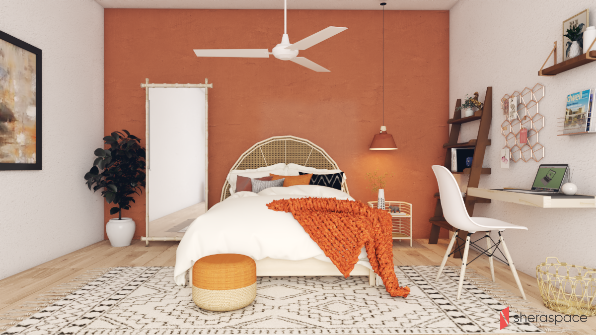
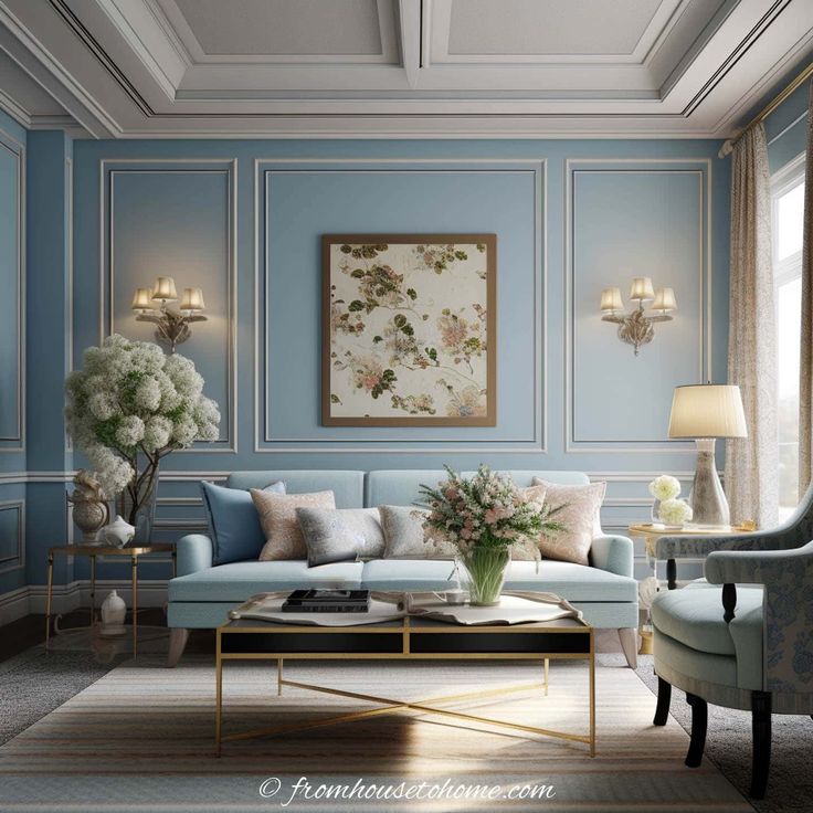
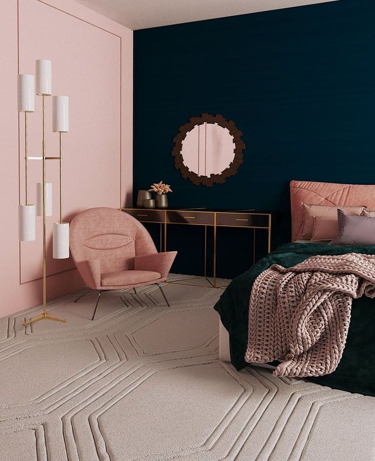
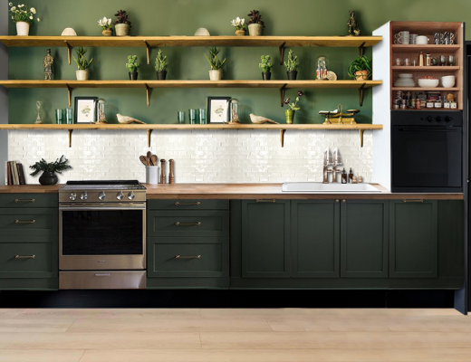
The psychological impact of paint colours is significant. Cool blues and greens are known to evoke a sense of calm, making them ideal for private retreats like bedrooms and home offices. On the other hand, warm reds, oranges, and yellows exude energy and are inviting, which makes them perfect for social spaces such as kitchens, living rooms, and dining areas.
Avoid using yellow in bedrooms if you’re aiming for a restful sleep environment. Instead, consider painting walls in soothing blues or greens for a tranquil atmosphere. Again, warm red can be great for dining rooms since it is known to boost appetite, but it may not be the best choice for home offices where concentration is key. If you’re looking to enhance creativity, consider incorporating shades of orange or green into your workspace. Go for chalk white or light blue in your seating area to create a formal look and choose bold colours like purple or tangerine for your living room to evoke a sense of playfulness.
Coordinate Colors
You shouldn’t add too many colours to your space- aim for a palette of three to five main colours that maintain harmony with each other. You don’t need to match the paint colours exactly but aim to create a cohesive look with complementary hues.
For a smooth transition between rooms, consider choosing a colour that is a couple of shades lighter or darker within the same colour palette. Neutrals like white, beige, or grey can serve as excellent unifying backdrop colours that allow for more flexibility with accent shades.
To further tie the look of your home together, repeat a bold accent colour from one space to another through the use of artwork, throw pillows, or other decorative items. This repetition of colour will create a sense of unity and flow throughout your home.
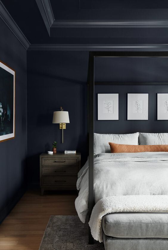
Don’t Forget The Ceiling!
To enhance the perceived height of low ceilings, opt for white paint, extending it onto any crown moulding to maintain a seamless upward flow. Using any shade that is lighter than the wall colour softens the contrast and creates an illusion of spaciousness. In smaller rooms like bathrooms, painting the ceiling the same colour as the walls can amplify the sense of expansiveness.
However, if you want to create a cosy atmosphere, go for darker shades like blue or black for the ceiling. Keep in mind that this tip will work best if you have an ample ceiling height, otherwise your space may end up looking congested.
Unsure about which paint would be perfect for your home? Sheraspace is here to help you out! To receive professional advice about your interiors, click here on Sheraspace or contact us at +8801738174440 today!
No Comments